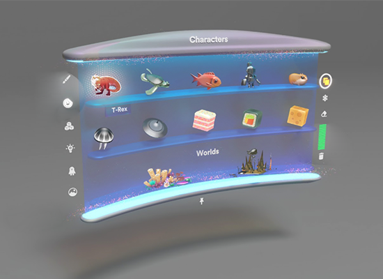
Spatial Mapping
Project: Create // Role: Lead Designer
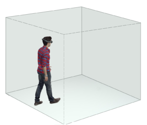
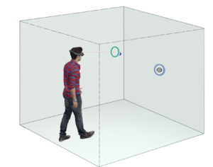
The process begins by surrounding the user within an invisible cube. Constrained to the user’s FOV (field of view), a reticle or “guide” is displayed, which is used as a visual compass to direct their gaze around each of the cube’s faces.
Each of the cube’s faces displays a series of visual targets or “waypoints” which require the user to overlap the reticle and waypoint for a few seconds as the system gathers room mapping data.
To provide visual clarity, a throbber progress bar is displayed within the negative space that is formed by overlapping of the reticle and waypoint.
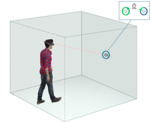
When the waypoint processing is completed, visual and audio effects are triggered to inform users wether or not the surfaces adjacent to the waypoint were mapped successfully. Additionally, a shader is overlaid to show which and how much of a surface was mapped.

As mapping data is successfully collected, the box dynamically scales to match the correct distance of the physical surface relative to the user’s headset.
The process continues until the minimum requirements have been fulfilled.
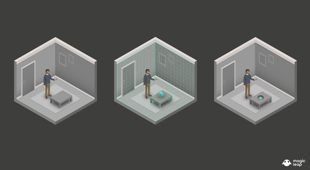
The image bellow is the final wire-frame for this process, testing informed us that recurrent users found the process tedious after having to go through it every time they would open the app. So we added a branch to the user flow, which would allow more experienced users to map their space at their own leisure and determine the quality of the map by themselves.
As a fallback, we designed the system so that users could switch back and forth between either “guided” or “unguided” flows at any time during the process.

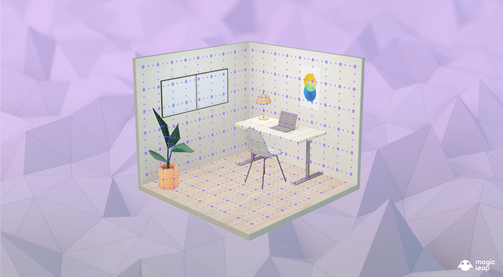
A unique challenge when designing for Spatial Computing is the fact that content is no longer bound to a screen or flat surface, it can exist anywhere in the real world, as such we had to define a set of constraints to present relevant information to users in the most coherent way possible. We defined two principal use-cases to define how prompts would be displayed throughout the experience.
Head Constrained Prompts – These remained constrained to the user’s FOV (Field of View) and had user-centric translation parameters to move along the X (horizontal) and Y (vertical) axis whenever the user looked on any direction. These also contained a distance awareness parameter, which controlled the Z (depth) axis relative to the user to prevent camera clipping or being able to stand on top of a prompt.
Diegetic Prompts – Used to display contextual tool-tips about the function or state of system level tools or virtual objects. These were anchored to specific objects such as the controller or virtual objects such as the Menu Interface. They would billboard towards the user’s head position to allow for legibility.
To prime users before they started the mapping process, we designed a series of illustrations featuring an avatar performing the steps required to properly map a room, these were then animated in Unity using the animation timeline. Supporting text instructions, and VO (voice over) were also used to account for people with visual disabilities.
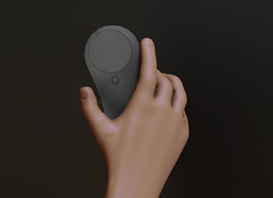
Once users were ready to start the mapping process, they were instructed to use the control to point at an ‘accept’ button and then press the trigger to begin.
We evaluated several visual directions before we decided on the final version, we found out that simple and clear graphics that were easy to understand helped direct the users attention as they went through the mapping process.
We used metaphors like a floating compass arrow to guide users visually, we used concentric circles as targets they could focus on, and we made sure each waypoint resolved in a satisfying way in order to reward the user’s participation.
The image bellow illustrates a breakdown of the visual design elements we used for the Spatial Mapping process.
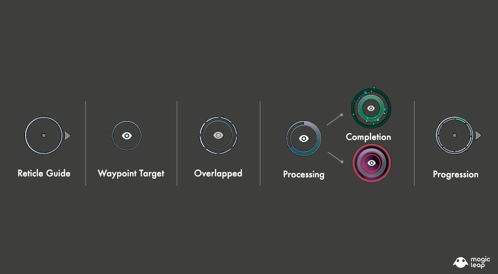
Reticle Guide – This is a head-locked reticle guide displayed at a fixed distance from the user’s head, the arrow displayed outside of the circular form pointed users towards the nearest waypoint target.
Waypoint Target – These were displayed on each of the invisible cube’s faces, and would only disappeared after users looked at them for a specific amount of time.
Overlapping State – This state was achieved whenever users interlocked their reticle guide with any available waypoint target.
Processing State – Having two concentric circles afforded us being able to utilize the negative space as a throbber fill progress bar that represented the remaining time that was necessary for the waypoint to be processed.
Completion State – Once the throbber filled the negative space between the reticle and the waypoint, a completion state was determined. If successful, a green burst and a checkmark icon would be displayed. If unsuccessful a red pulse and an ‘x’ would be displayed, followed by a message with suggestions for possible actions the user could take to resolve that specific area successfully (get closer, turn on lights, etc)
Progression – After the first successful completion of a waypoint was registered, the reticle would reveal a segmented bar to represent progress, once all segments were filled it meant mapping requirements had been fulfilled and the process had been completed.